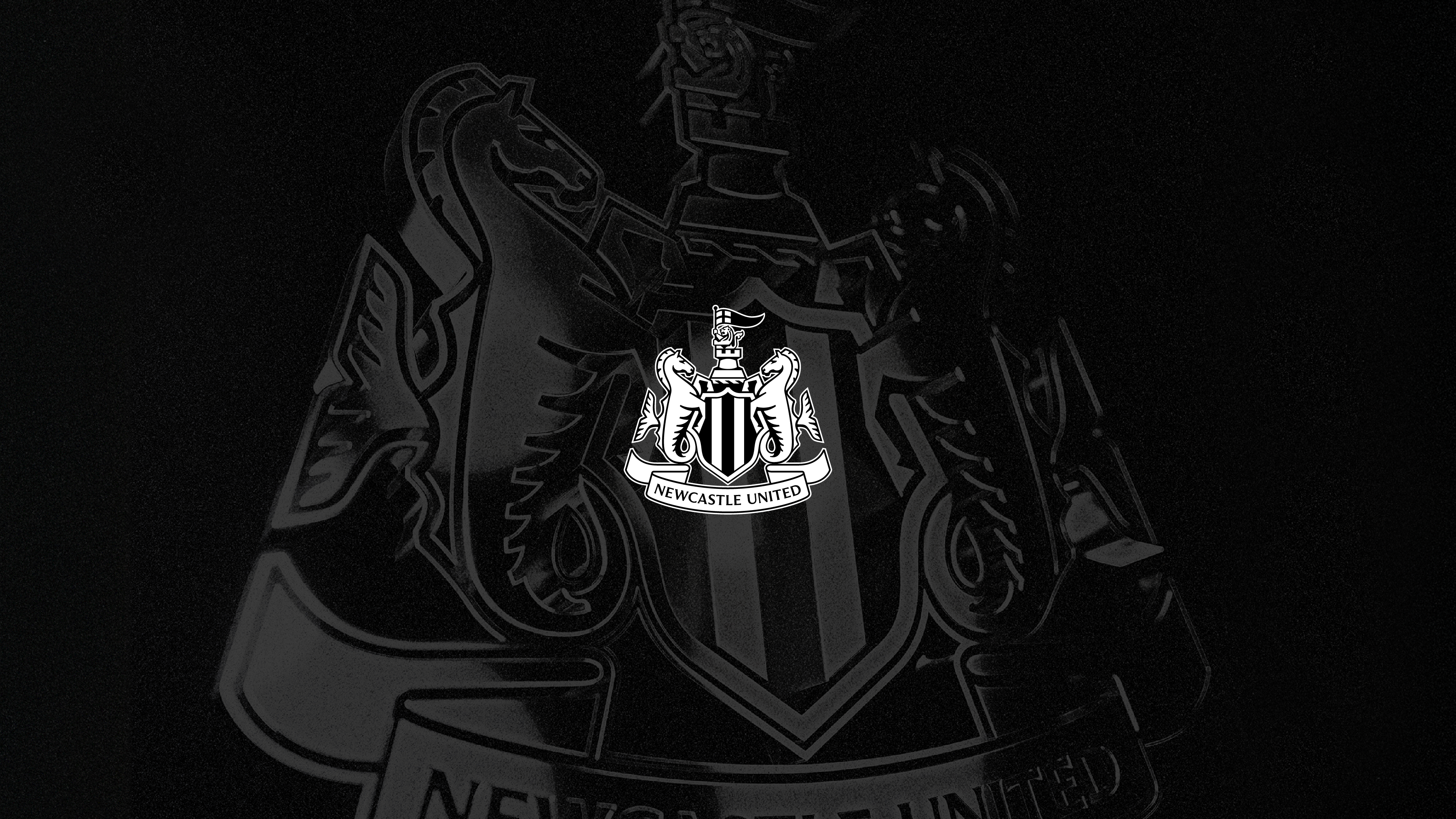
Our new crest is the culmination of more than two years of comprehensive consultation, including supporter events, focus groups, workshops and surveys.
We’ve consulted leading industry experts on the challenges presented by our existing crest and how we can evolve in line our world-class ambitions. And we’ve taken our research out to thousands of fans around the world to discuss and scrutinise it, and to listen to feedback.
Now, after creating a shortlist of three new crest options and commissioning an independent poll completed by more than 27,000 supporters, our new crest has emerged as a clear winner with two-thirds selecting it as their first choice.
Our new crest will be put in place progressively across physical signage and digital and broadcast platforms over the coming months and will be in place on our kits for the 2027/28 season. We’ll bring supporters news very soon on exciting new retail options.
‘An enormous privilege and responsibility’
David Hopkinson, CEO at Newcastle United, said: “I have never worked anywhere that feels as proud and passionate about its crest than the way this club does, so this body of work is an enormous privilege and responsibility for all of us.
“The club has asked supporters questions that we did not know the answers to, and they told us plainly: protect what we have, keep the elements we love, and do not start again.
“Every decision after that has been made inside the margins our fans drew, and it is only right that our fans have had the final and decisive say on the outcome.
“Our crest came from the city's own coat of arms, and it still does. It honours where we have come from, it represents who we are now, and it will become an iconic symbol for generations of supporters around the world who believe in it and unite behind it."
‘Helping to shape the future of our crest is an incredible honour'
Kenneth McIver, the club's Chief Creative Officer, said: “As a lifelong fan, our crest was the thing I covered my schoolbooks in. It's the crest I watched my heroes playing in during the 80s and 90s, so helping to shape the future of our crest is an incredible honour.
“I’ve been lucky enough to work on some of the biggest design projects in world football during my career, and none of them came with pressure like this because of my roots and my passion for the club.
“That pressure has come from the thousands of fans we have engaged with, but also from my family, from the people I sit with in the stands at St. James’ Park, and from a group chat with friends that has shown me no mercy for two solid years. I have been asked more than once, and not always politely, whether I understand the importance of this work, and I absolutely do.
"Our new crest has been crafted with the utmost respect for our heritage and identity, and with our vision and ambitions in mind. Every line has been drawn, redrawn, reviewed, and tested across so many formats, textures and platforms, and it delivers.
“Nothing has been changed simply because it could be. The message from fans has been consistently clear, and every element is geared towards producing a crest that will continue to connect and inspire people for many years to come.”
Why new? And why now?
Through so many ups and downs, from touching distance of silverware to winning the cup, and across our famous Champions League nights, our current crest has been a constant since 1988.
But in a modern digital world, the limitations and flaws of a 38-year-old design have become obvious. For such a beloved symbol, its detail and uneven lines don’t show up as they should on modern platforms. Individual elements lose their shape and blur on phone screens, in broadcast graphics, in stitching, and at the scale and speeds that the modern world demands.
Addressing this was never simply a question of making do. It became a question of pride, aligning with a commitment to ensuring every facet of Newcastle United is given the care, the thought and the world-class treatment it deserves.
So, in 2024, with the deepest respect for what our crest means, we began a full review.
We kicked things off with an honest question rather than a fixed answer: does our crest serve our club as well as it deserves?
What we found out
Following extensive design research and supporter consultation, two answers came back with real force, and they have shaped every decision since.
The first was that the need for change was understood by those who took part in our workshops and fan events. Four out of five survey respondents acknowledged the practical limitations of the current crest, even while telling us how deeply they love it.
We also asked supporters directly whether the crest should be redesigned from scratch or carefully updated. 84% of our respondents were clear: update what we already have. They gave us a clear instruction on how we should do it: simplify and protect what already exists. Do not reinvent and do not start again. No generic circular badge, and no change for change's sake.
Phasing
Crafting the options
Once supporters had ruled out a complete redesign and named what had to stay, our designers – led by Kenneth McIver – got to work.
They scrutinised every tiny detail over months, spent hundreds of hours researching, and produced thousands of variations of every individual element that we were instructed to retain.
The team created three balanced options – changing the craft but not the distinct character.
Line weights were evened out. Details were reviewed and refined, and the shapes redrawn so that the options hold together when small or large, in colour or in mono, and whether in stitching or on screen. Seen from the far side of the stadium, on a screen or on a shirt across a crowded street, they stood up to the test.
But there was room for only one winner.
The poll
Supporters, including our Fan Advisory Board, have encouraged us to show transparency around our poll, and it is right that we do so.
We can confirm that 27,348 eligible supporters completed the polling process, including men's and women's season ticket holders and Mags and Mags+ members.
The poll was limited to those with these demonstrable connections to the club in order to protect the process from outside interference, ensuring only Newcastle United supporters shaped the outcome.
The poll was administered independently of the club, and the count was independently verified as follows: First-choice votes
Option C 64.8% Option B 19.0% Option A 16.2%
The details within our new crest
Our crest is drawn from Newcastle's city coat of arms. Few crests in football are so deeply rooted in the place they come from, so supporters were emphatic about what should remain.
Our castle, which inspires our name and has represented our brave city for centuries, has been fortified within our new crest design. It is sharper and more distinctive.
So too is our redesigned black and white shield, flanked by hippocampi – a mythological nod to our proud maritime history of building ships, inspiring trade and helping to shape the world.
And our demi-lion, pennon and ribbon bearing the club's name have also been refined, adding balance and alignment to the overall structure. The details matter.
We are pleased to publish a full summary of the consultation, covering the research methodology, the questions asked at each stage, the findings from the workshops and the complete voting data at newcastleunited.com/en/our-crest.